Kraft Paper Coffee Bags White vs Brown Differences
Choosing coffee packaging looks simple. But once you start designing and printing, small details become important. The color and finish of kraft paper can change how your bag looks and how your brand is read.
White kraft and brown kraft share the same goal: they give coffee packaging a strong paper look. White kraft uses a brighter surface that supports clean printing. Brown kraft keeps a natural tone that supports a craft style, but it can limit light colors unless you plan for it.
If you want fewer surprises, you need to understand how kraft paper is made, how color changes printing, and how customers read “signals” from packaging.
What Is Kraft Paper
Kraft paper is a strong paper type that packaging brands use a lot. The word “kraft” links to strength, and that fits what roasters need. Coffee bags get handled, shipped, and stored. They need a paper layer that does not tear easily. Kraft paper starts with wood. Mills turn wood chips into pulp. Then they use the kraft process. This process separates fibers and removes much of the lignin. That helps the paper stay strong. It also shapes the paper’s natural color.
How kraft paper is made
Most kraft paper starts with a “cooking” step. Mills cook wood chips with chemicals that help release strong cellulose fibers. This creates pulp that works well for packaging because it keeps long, tough fibers.
After that, mills wash and refine the pulp. They form paper sheets, press them, and dry them. Then they wind the paper into rolls. After this point, the mill can keep the paper unbleached or bleach it to make it brighter.
White kraft and brown kraft differences
White kraft paper goes through an extra step. Mills bleach the pulp to remove more color. This creates a cleaner and brighter base. Designers like it because it supports sharp contrast and more accurate color prints.
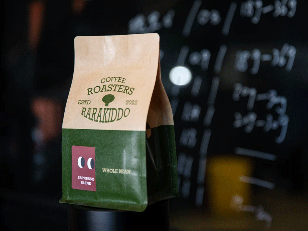
Brown kraft paper skips the bleaching step. It keeps a natural tan or brown tone. Many brands like the “raw” look. It also fits a simple design style, like one or two ink colors plus a strong logo. Both types can work in coffee packaging. The bigger difference is not strength. It is how the bag looks after printing and how it supports your brand story.
Why Kraft Paper Color Matters for Coffee Packaging
Paper color changes how your bag prints and how it reads on a shelf. Brown kraft can make inks look darker or more muted. Light colors can lose contrast because the brown base shows through. White areas will not look white unless you use a special print plan like white ink underprint or another finishing option.
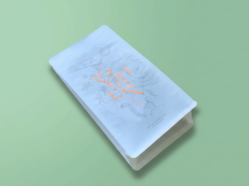
White kraft makes design control easier. It gives you a lighter base. Your roast notes, origin info, and QR codes often look clearer. This matters when you sell specialty coffee and you need readable details, not only a logo.
Print contrast and color shift
Brown kraft can “warm up” colors. It can push bright tones toward a deeper shade. That is not always bad. It can look premium if you plan for it. Still, it can hurt brands that need bright, clean colors.
White kraft helps you keep colors closer to your artwork. It supports fine lines and small fonts. If you build many SKUs and want one clean design system, white kraft often gives more consistent results across the line.
Shelf signal and sustainability signal
Many shoppers use packaging as a fast signal for quality and values. Some buyers connect natural brown kraft paper with “eco” or “craft.” Some buyers connect clean white packaging with “premium” or “modern.” Your goal is to match the signal to the truth of your packaging choices.
You can also support the idea with real consumer research. For example, PwC reported that consumers say they would pay about 9.7% more on average for sustainably produced or sourced goods, even when cost pressure stays high. McKinsey’s 2025 Europe packaging survey also describes a cost-sensitive trend: about half of surveyed consumers say they may pay more for sustainable packaging, but willingness to pay has fallen compared with earlier years and stays sensitive to price. So color choice can help your story, but you still need the right structure, barrier layers, and price plan.
Which Kraft Coffee Bag Color Fits Your Brand Best
You do not need a “winner.” You need a kraft paper bag color that fits your coffee, your design, and your production plan. Choose white kraft paper coffee bags when you need print clarity. They work well for detailed roast and origin information, tasting notes, brew guides, QR codes, and small required text. White bags also support bright brand colors and clean layouts. They can look clearer in product photos too, which helps if you sell online. A simple way to decide is to print a small test run and take shelf photos under real lighting, then compare them with your mockups.
Choose brown kraft coffee bags when you want a natural look and you can design around the paper tone. Brown kraft often works best with bold dark inks, simple logos, earthy palettes, and minimal layouts with strong contrast. It can make the paper itself part of the brand style, which fits craft and origin-led stories. Still, light colors and clean whites can be hard on brown kraft unless you use options like a white ink underprint, which can affect cost and lead time. Also, paper color does not protect coffee by itself. Coffee still needs barrier layers and strong heat sealing, so it helps to match the kraft color with the right barrier level, closure, and valve plan for your product.
Making the Right Choice for Your Coffee Packaging
Choosing between white and brown kraft paper coffee bags is an important decision for your brand. Both options offer durability, eco-friendliness, and strong protection for your coffee. Still, the color and finish can shape how customers see your brand. White kraft paper gives a cleaner, modern look that suits bold designs and premium lines, while brown bags create a more natural, rustic feel that fits organic and sustainability-led brands. When choosing packaging, think about your brand identity, your audience, and your sustainability goals. The right bag can help your coffee stand out on the shelf.
At YamiPak Coffee, we offer eco-friendly packaging solutions for roasters, including FSC-certified brown and white kraft paper bags, with eco-friendly liners for enhanced barrier protection. We use sustainable, water-based inks for UV printing, ensuring your branding stands out while minimizing environmental impact. These inks are low in volatile organic compounds (VOCs) and are recyclable. To maintain the freshness of your coffee from roastery to consumer, we also provide resealable zippers and other effective packaging solutions.
For more information about kraft paper coffee packaging, feel free to contact the YamiPak Coffee team.
Key Takeaways
- White kraft coffee bags are better for sharp printing and readable details, especially when you need small text, QR codes, and bright brand colors.
- Brown kraft coffee bags fit a natural, craft look and work best with simple designs and dark inks, but light colors may need a white underprint to stay clear.
- Paper color affects branding and print results, but freshness depends on structure—choose the right barrier, seal, and valve options for your coffee product.
Share This Story, Choose Your Platform!

Chris Li
Chris Li is the Marketing Director at YamiPak coffee, with over 10 years of experience in packaging and printing. Passionate about sustainable solutions and innovative design, Chris helps brands create impactful packaging that leaves a lasting impression.