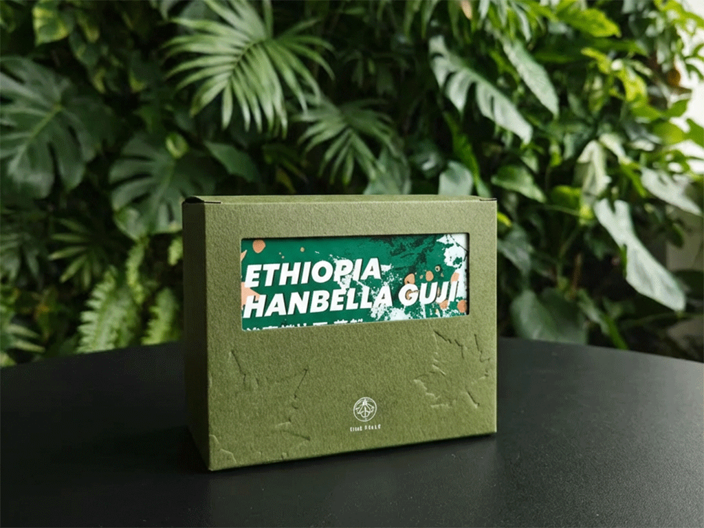
Coffee Box Design with Embossing & Debossing
Coffee boxes often look “premium” on screen, then fall flat in a customer’s hands. Smooth cartons can feel generic, and in specialty coffee that can quietly drag down perceived value—especially when buyers compare you to brands that nail the unboxing moment. That gap matters because shoppers judge quality before they taste a single sip. The fix doesn’t require louder graphics. It often starts with touch: embossing and debossing that turn Coffee Box Design into something people can feel.
Embossing raises artwork above the surface, while debossing presses it into the board. In coffee box design, both finishes create tactile cues that make logos, patterns, and key details more memorable. Used with restraint, they support minimalist layouts, help customers find origin or roast notes faster, and make a box feel gift-ready—often without extra ink coverage or complicated structures.
What Is Embossing and Debossing in Coffee Packaging?
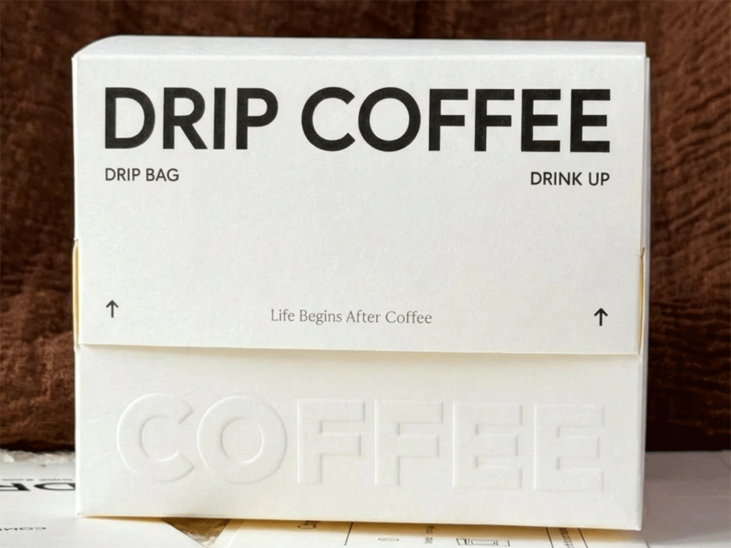
Embossing and debossing are finishing techniques that create raised or recessed relief on paper and paperboard. Embossing lifts a design above the surface. Debossing presses a design into the sheet. Both effects add depth through light and touch, not extra ink. In print shops, you can run them as blind relief with no ink. You can also register the relief to printed graphics or foil for stronger contrast.
To create relief, printers use a matched tool set. It includes a stamp and a make-ready, also called a counter-die. The job runs with heat and high pressure. The stamp pushes the board into the groove of the make-ready. This helps the pattern hold its shape. Paperboard guides describe this as making the relief precise and more permanent. Tooling materials vary by need. Suppliers offer dies in magnesium, copper, and brass, among other options. Some builds also allow multi-level or sculpted 3D effects.
In coffee packaging, relief supports coffee box design when you keep it readable and durable. Board choice matters because relief depends on fiber compression and surface finish, including coatings. Artwork also needs room to form clean edges. One setup guide recommends at least 2 mm line thickness and 1 mm spacing. It warns that smaller gaps can cause “plugging.” Keep relief away from tight folds, scores, and glue zones. This placement protects alignment on assembled cartons. It boosts unboxing perception fast.
How Embossing & Debossing Enhance Coffee Box Design
Texture influences how people judge products because touch shapes expectations. In food and beverage research, packaging weight has been linked with higher desire and willingness to pay through changes in perceived flavor intensity and overall evaluation. This does not mean heavier is always better. It shows that tactile cues can shift value perception before the first sip, which is exactly where coffee box design competes.
Embossing adds confident emphasis. A raised logo or seal catches light from multiple angles, so it reads quickly on a shelf and looks stronger in unboxing videos. Debossing creates quieter premium cues, such as recessed typography, subtle borders, or a pattern field that adds depth without crowding the front panel. With coffee box design, the best results usually come from one hero tactile element, supported by simpler details.
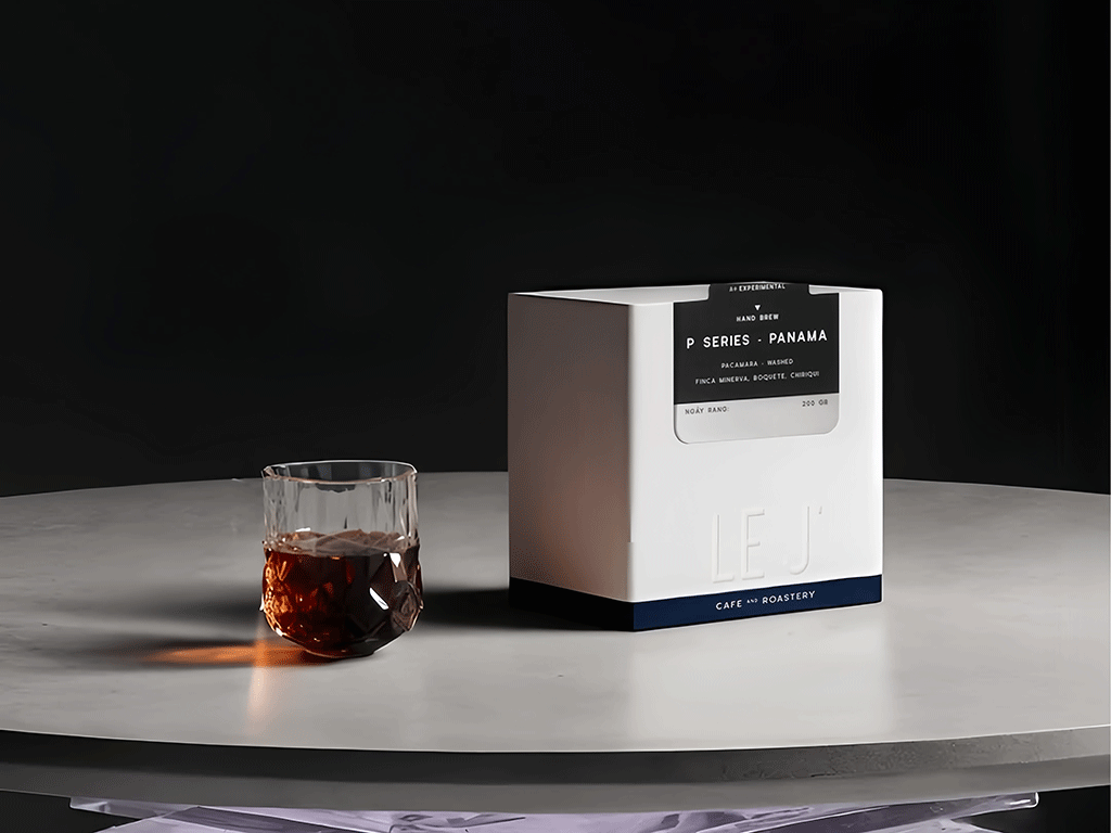
For Le J’, we produced an embossed coffee box that feels premium the moment customers pick it up. We kept the embossed artwork bold and placed it on a stable panel to reduce distortion near folds. This also keeps the front panel clean for e-commerce photos. We checked depth and alignment during sampling so the texture stayed crisp after assembly and shipping.
Tactile details also help differentiation. Studies on embossed labels report higher purchase intention and willingness to pay when embossing increases perceived uniqueness and encourages touch. You can use texture to guide attention without extra ink, such as a shallow raised frame around brew tips or a debossed motif that signals origin while preserving whitespace for readability.
Key Considerations for Embossed and Debossed Coffee Boxes
Design the relief artwork for manufacturing. Production setup guidance recommends keeping emboss/deboss strokes at least 2 mm thick with about 1 mm spacing between elements; otherwise “plugging” can happen, where details merge into a solid shape during pressing. These limits protect small icons, thin type, and fine borders in coffee box design.
Plan placement around folds and glue. Relief placed too close to scores or tight corners can distort during folding and assembly, and it can create pressure points that show wrinkles under light. Keep embossed/debossed areas in stable panel zones, then test a physical sample under real lighting. This approach keeps coffee box design consistent from prototype to bulk runs.
Balance impact, cost, and sustainability. Dies add setup cost, so reserve relief for the elements that carry brand value: the logo, a seal, a signature pattern strip, or a simple frame. If you want the cleanest material story, blind embossing or blind debossing can deliver premium feel without extra ink layers, and it still works well on recycled boards when the fiber structure supports crisp forming.
Finally, here’s how we help at YamiPak Coffee. We offer embossing and debossing on both coffee bags and coffee boxes, so your packaging feels premium in-hand and consistent across formats. Our packaging options use renewable or responsibly sourced materials, including recyclable paper-based coffee boxes and sustainable bag structures such as kraft paper, rice paper, and multilayer films with eco-focused liner options.
More importantly, our coffee bags and coffee boxes can be fully customized to match your brand style and highlight key coffee details like origin, roast level, or tasting notes. We also support low minimum order quantities (MOQs) for micro-roasters who want to stay agile while still presenting a strong brand identity and a clear commitment to sustainability.
Share This Story, Choose Your Platform!

Chris Li
Chris Li is the Marketing Director at YamiPak coffee, with over 10 years of experience in packaging and printing. Passionate about sustainable solutions and innovative design, Chris helps brands create impactful packaging that leaves a lasting impression.
