Coffee Packaging Design Tips for 2026
Too many coffee bags still look clean but forgettable. In 2026, old coffee packaging ideas can make a brand disappear before shoppers even read the label.
The best coffee packaging design tips for 2026 focus on four things: tactile texture, clear typography, smart colour use, and sustainability that is easy to understand. Good design now needs to feel human, read fast, shape flavour expectations, and explain materials and disposal more clearly.
That matters because coffee buyers often decide fast. They notice the bag before they taste the coffee. Coffee packaging tips do more than add visual appeal. They help coffee bag design show quality, guide attention, set flavour expectations, and build trust.
Tactile packaging in coffee packaging design
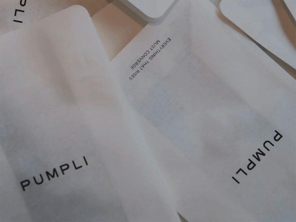
In 2026, tactile packaging matters more because design is moving away from a cold and overly digital look. Trend forecasts point to more realistic textures, tactile details, and organic, imperfect visuals. That shift suits coffee because it is already a sensory product. In coffee bag design, tactile packaging adds a stronger first impression through both look and feel.
Tactile packaging is not only about decoration. It shapes the first physical impression. Matte films, uncoated paper looks, embossed logos, and light surface variation change how a bag is read before it is opened. This is why many current coffee packaging ideas use soft-touch or matte finishes instead of high-gloss surfaces for origin-led coffees today.
Tactile packaging also changes how people read the product inside. Studies show matte surfaces can make food seem more natural. In coffee, that helps brands signal craft, transparency, and origin. Coffee packaging tips should treat finish as part of brand meaning, not as a small visual detail.
The use of tactile packaging depends on the product line. A high-end microlot can carry more tactile detail. A core retail line may need a simpler finish for larger runs. These coffee packaging design tips work better when finish matches brand voice.
How typography shapes coffee packaging design
Typography does more work in 2026 because coffee bags carry a lot of information in a small space. Buyers need to spot the brand, coffee name, origin, process, roast style, and net weight fast. At the same time, design trends are giving type more visual weight. In coffee bag design, typography needs to show character and stay easy to scan.
One of the most useful coffee packaging design tips is to make the main information easy to see. The coffee name and product line should come first. Supporting details should follow in a clear order. If illustration, pattern, or decorative lettering hides the key text, the bag becomes harder to read and slower to understand.
Clear hierarchy matters
A clear hierarchy keeps packaging information easy to scan, even when the bag includes a lot of detail. Title text, supporting copy, and technical data should each have a clear place. This is where many coffee packaging tips fall short. Brands often add strong visuals, then place origin and process notes in small, low-contrast text. That reduces readability and makes key information less useful.
Readable type in coffee packaging ideas
Typography still needs to read fast. Larger type, clear spacing, and wider letterforms work better for quick reading on shelf and online.
Coffee packaging design tips here are simple. Use contrast, leave space around the coffee name, and avoid very thin fonts for key information. Expressive type can show personality, but the details still need to stay clear.
Colour choices in coffee packaging design
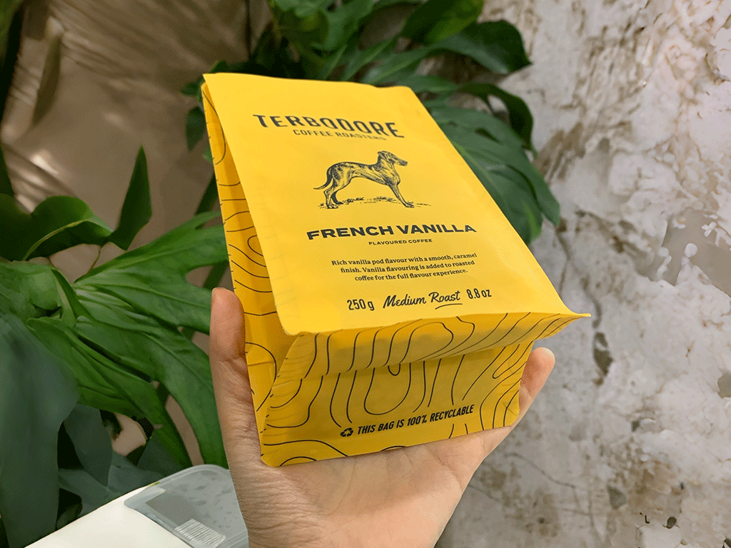
Colour is one of the strongest coffee packaging ideas for 2026. Design trends are moving towards brighter and more saturated palettes. Coffee research also shows that colour can shape expectation before a bag is opened. In coffee packaging design, colour is not only about shelf appeal. It can also help buyers guess how a coffee may taste.
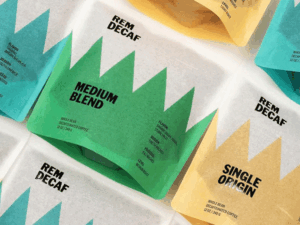
In one online study with 238 participants, different coffee packaging colours changed flavour expectations. Yellow packs suggested more acidity and citrus notes. Pink suggested more sweetness. Brown and black suggested more bitterness, body, aroma, and darker roast character.
A second study with 226 consumers showed the same pattern in coffee bag design. Pink packs made the same coffee seem sweeter and fruitier. Brown packs made it seem closer to brown sugar, cocoa, spice, and darker roast notes.
This is why good coffee packaging design tips should not treat colour as decoration only. Colour choices should match flavour direction as well as brand style. Bright colours often fit lighter and fruitier coffees. Darker tones often fit chocolate, nutty, and deeper roast profiles. Good coffee packaging ideas help buyers understand the coffee faster.
The shift towards sustainable coffee packaging design
Sustainable coffee packaging in 2026 is not only about using green colours or kraft-looking materials. It is more about making packaging easier to understand and easier to dispose of correctly.
As packaging standards become stricter, coffee brands need to be clearer about materials, recyclability, and freshness protection. Simple information is more useful than vague green claims.
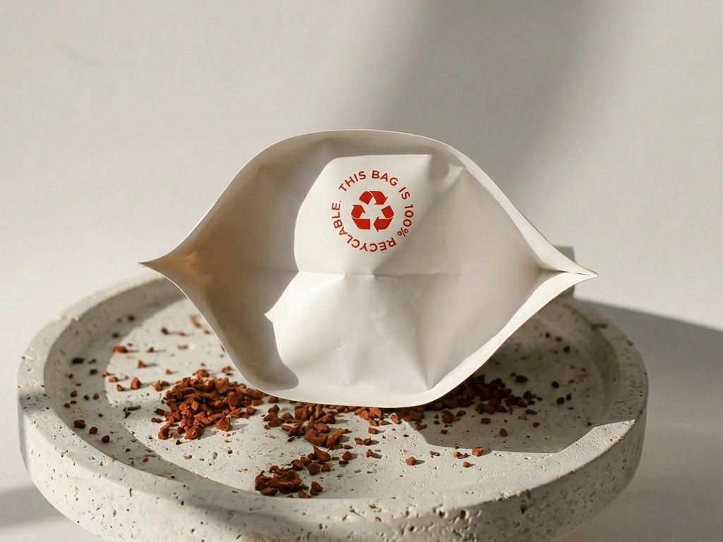
Sustainable packaging also needs to protect the coffee. Roasted coffee loses quality when oxygen, light, and moisture get inside the bag. Coffee packaging design should support sustainability and freshness at the same time.
This matters to customers too. NielsenIQ reported that 46% of consumers want brands to help them live more sustainably. Clear instructions and honest claims make that easier, and better packaging choices matter.
At YamiPak Coffee, we work with coffee brands to create custom packaging that supports clear branding, product protection, and everyday use. From coffee bags and boxes to cups, sleeves, and other printed packaging, we offer practical packaging solutions designed around real product and service needs.
Get in touch with YamiPak Coffee to explore custom coffee packaging
Key takeaways
- Texture is becoming more important in coffee packaging design for 2026.Matte finishes, paper-like surfaces, and tactile details can make packaging feel more real, more premium, and easier to remember.
- Typography and colour now do more than decorate the bag.Clear type helps shoppers read key coffee information fast, while colour can shape flavour expectations before the bag is even opened.
- Sustainable coffee packaging needs to be clearer and more practical in 2026.It should protect freshness, explain materials and disposal simply, and avoid vague claims that do not help the customer.
Share This Story, Choose Your Platform!

Chris Li
Chris Li is the Marketing Director at YamiPak coffee, with over 10 years of experience in packaging and printing. Passionate about sustainable solutions and innovative design, Chris helps brands create impactful packaging that leaves a lasting impression.